A Long-Established Regional Newspaper Takes on the Challenge of Creating Value for the Digital Generation
Chugoku Shimbun Co., Ltd. is a regional newspaper that supports news coverage in the Chugoku region of Japan, centered on Hiroshima. With a history spanning 130 years, it has supported local life across a wide range of areas, from news reporting to community events.
In recent years, while it has become easy to access information online and via social media, verifying the accuracy of that content has become increasingly difficult. This project was sparked by a request to explore, together with Chugoku Shimbun, what the company can uniquely offer as the local newspaper closest to the current generation living in such an era. We have embarked on this challenge in Hiroshima to reexamine the core value of Chugoku Shimbun and create new value for the digital generation.
Fenrir joined the project as a service design partner, supporting a wide range of initiatives from service planning and development to promotion and growth activities.
Considering What Only a Local Newspaper Can Do For the New Generation
Our research revealed that the younger generation is drowning in information. With the widespread use of smartphones and social media, the volume of unverified information has exploded, and we observed a strong tendency among young people to prioritize the reliability of information when gathering it. We also discovered that the media outlet they trust the most is, in fact, the newspaper.
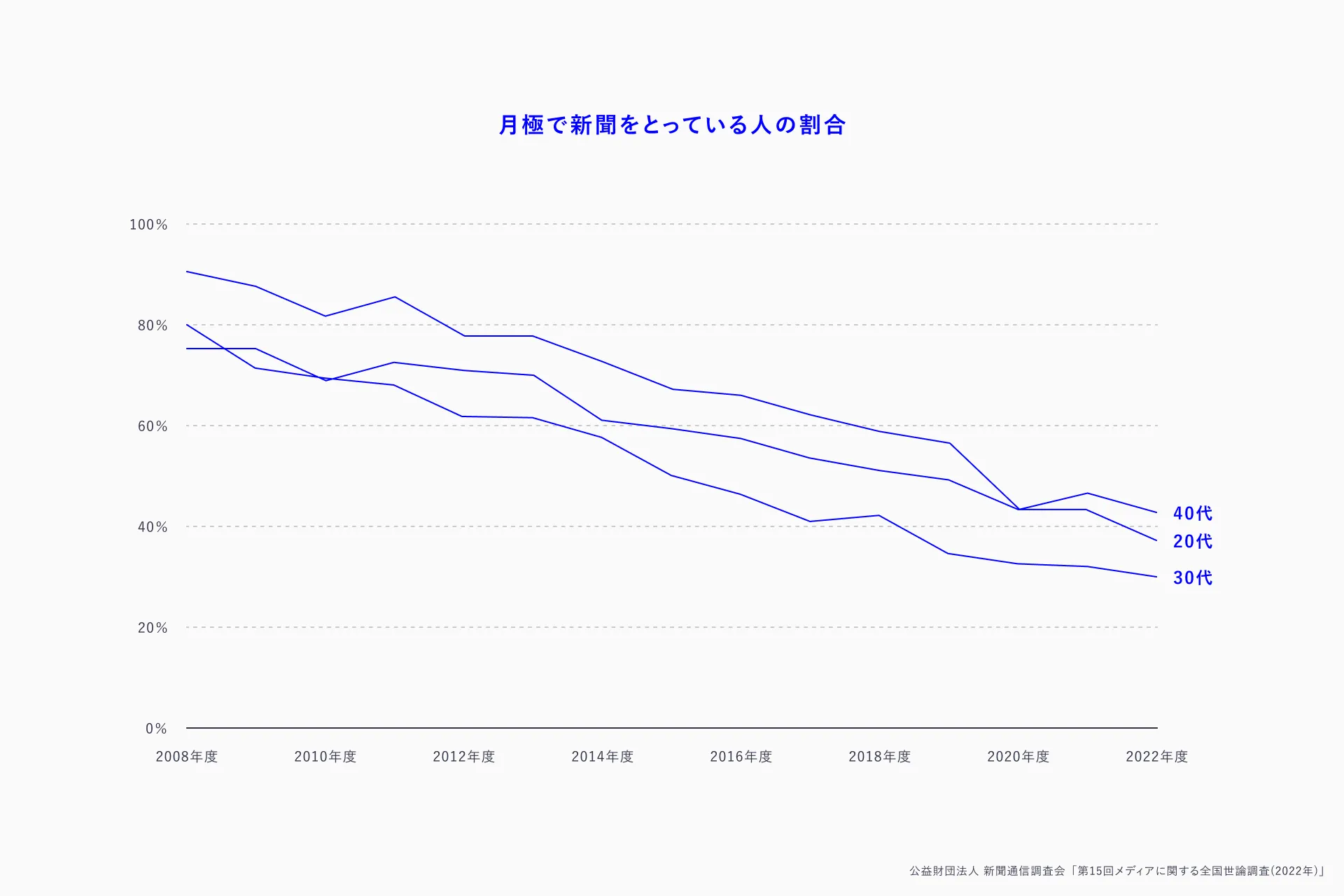
Based on this, we concluded that for the digital generation, the value lies not in the physical newspaper itself, but in the information and insights possessed by the reporters who produce it. The Chugoku Shimbun’s strength lies in the fact that its readers and reporters live in the same city. Using local news as a starting point, readers can connect with reporters and develop their own ways of engaging with information and forming perspectives. We sensed the potential to create a news experience unlike any before.
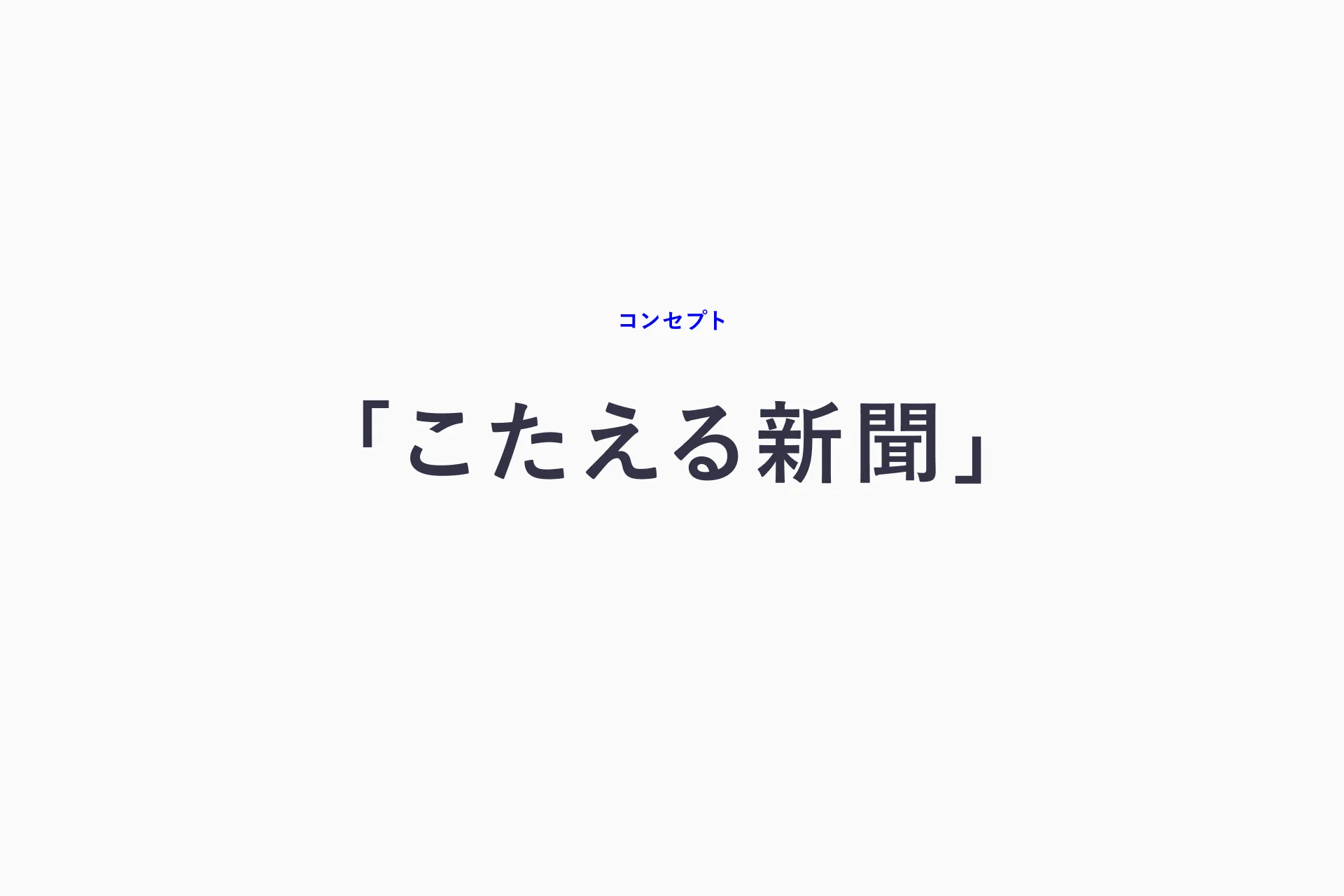
The concept that emerged from these thoughts is the “Responsive Newspaper.” It’s a service designed to help users let go of preconceptions about newspapers, such as being “one-way” or “too difficult”, by communicating from the user’s perspective, thinking together with them, and responding to their needs. “Discover, Learn, Create Together”, that is “Mimimi.”
The time-pressed digital generation can easily check the news through visually-driven content. If reading an article sparks questions or thoughts, users can ask other users or reporters directly. This initiative, delivering news from the same perspective and fostering learning and interaction, is made possible precisely because the Chugoku Shimbun is at the heart of local information.
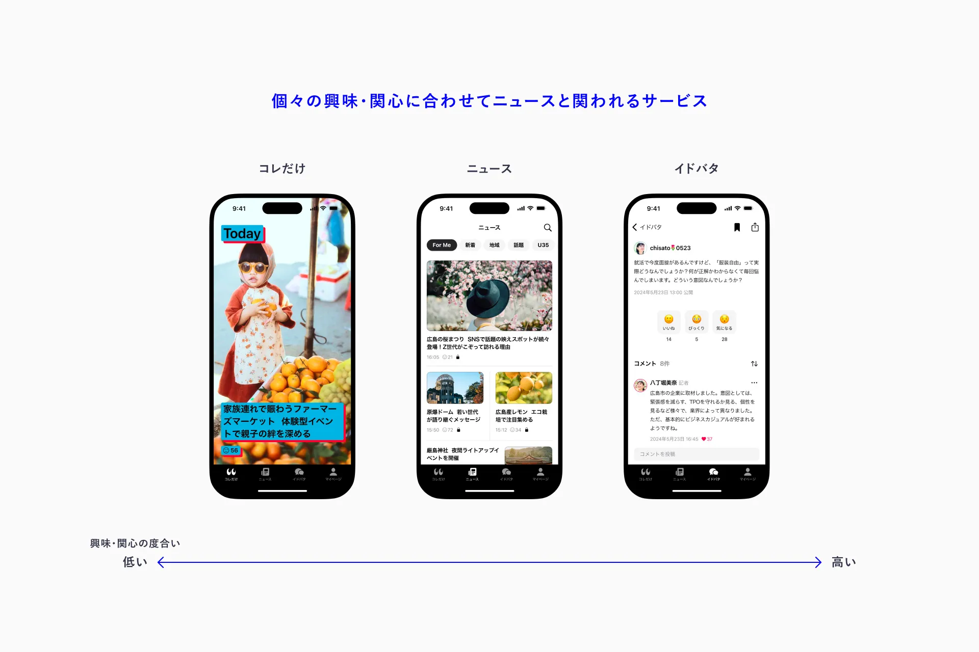
The aim of this service is not merely to create a connection with the younger generation, but to examine how the Chugoku Shimbun engages with local residents. We aim to foster a two-way relationship with users, updating our reporting and services while incorporating their opinions and feedback. Through “Mimimi,” we’re exploring a new way of delivering news, one only made possible by a local newspaper, where reporters who live in the same city as our readers create the content.
Thinking Seriously About the Collaborative Relationship with the Digital Generation
Creating a great user experience isn’t just about making the product better. It requires a comprehensive approach from every angle, including building an organization to nurture the product, refining operational methods, and communicating with users.
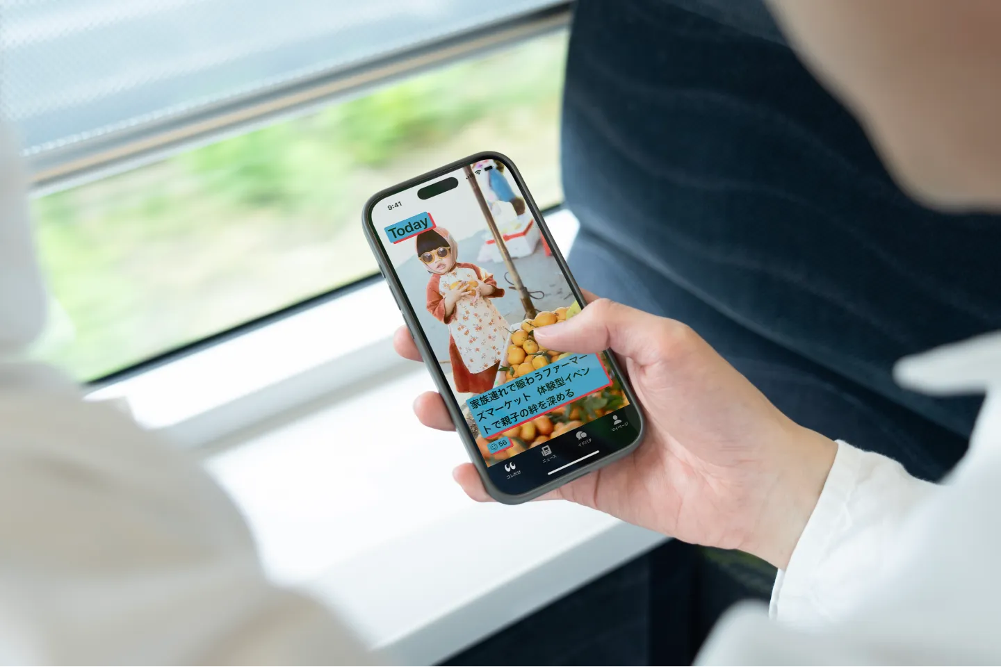
On the “Must See” screen, the app’s flagship interface, we’ve laid out large news images designed for portrait orientation. We prioritized usability and performance to ensure easy one-handed operation. Furthermore, while the color scheme may seem bold at first glance, we adopted the APCA[1] contrast standards with accessibility in mind, striking a balance between visual impact and readability. Our goal is to create a news experience that is visually engaging and enjoyable, rather than one focused on reading fine print.
[1] APCA (Advanced Perceptual Contrast Algorithm) is an algorithm that evaluates contrast ratios based on human visual characteristics to improve the accessibility of digital content. It places greater emphasis on visibility in real-world usage scenarios than conventional methods. Its adoption in WCAG 3 is currently under consideration.
Additionally, prior to the release, the two companies jointly held an internal briefing session at the Chugoku Shimbun to share the significance of the service, our development goals, and future prospects. Approximately 400 employees participated, including those at the venue and those watching the live stream, and the Q&A session featured some lively discussions.
After the event, we received a number of comments such as “That was great! I’m rooting for you,” which helped build momentum leading up to the release.
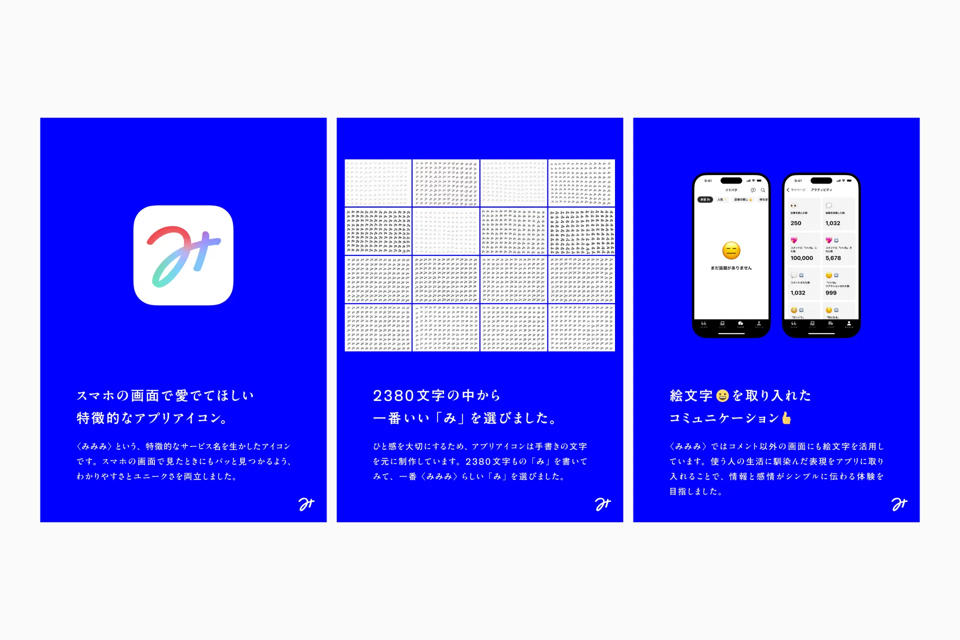
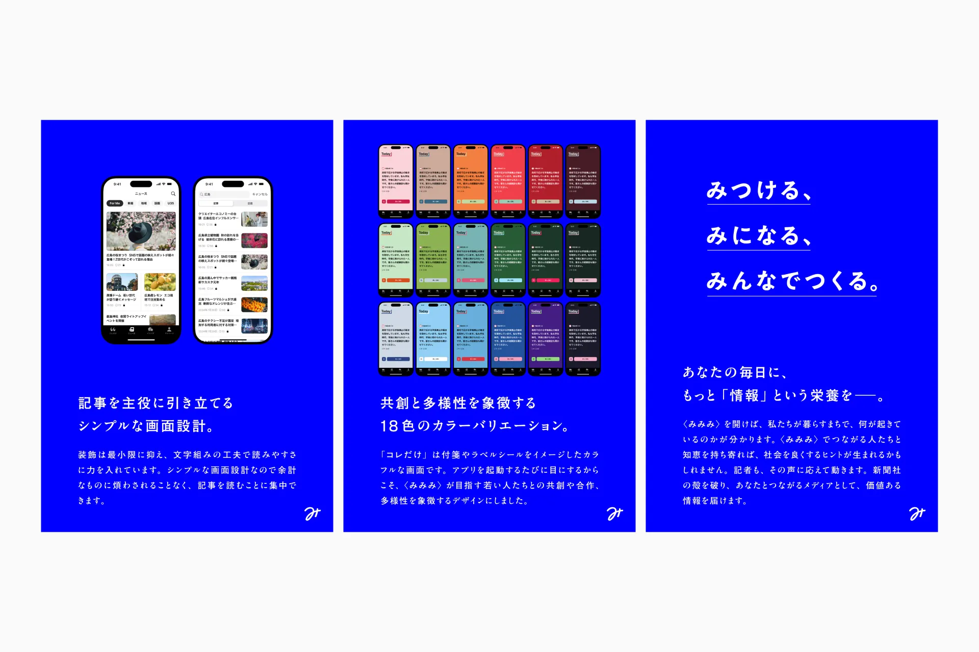
For user communication, we set our initial goal to raise awareness of “Mimimi” and planned an advertising campaign centered on social media and transit ads.
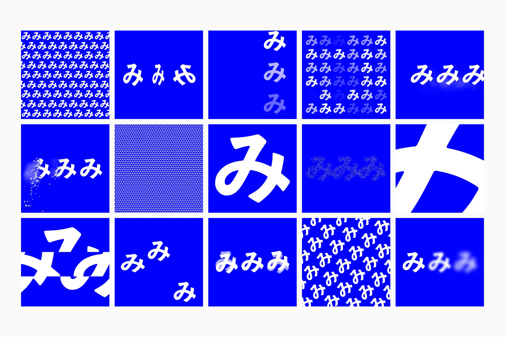
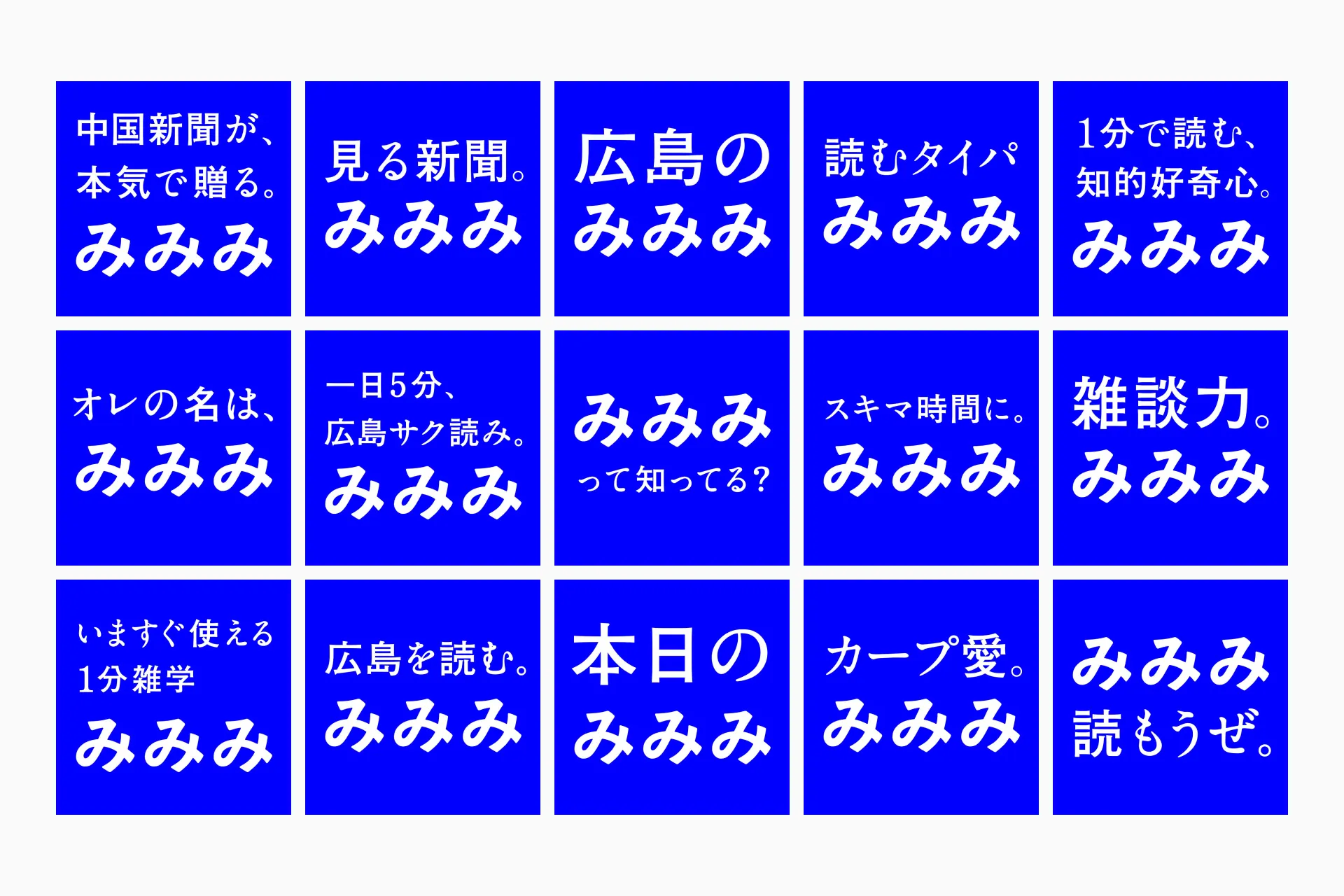
For social media ads, we decided to run video ads on Instagram due to the high amount of time spent on the platform by the digital native generation and the high precision of targeting. However, even though social media is a platform with high user engagement, ads that appear in the feed are rarely noticed. Therefore, to get users to pause their scrolling even for a moment we focused on creating unique and eye-catching ad concepts. We produced over 30 variations across two approaches: motion graphics featuring the hiragana character “mi” moving dynamically, and copy that conveyed “Mimimi’s” stance and benefits.
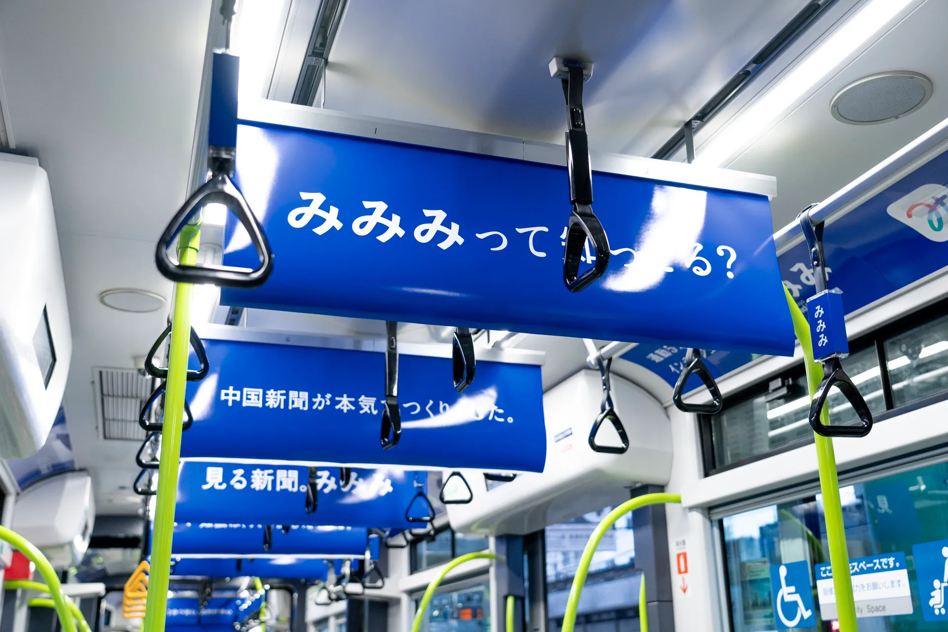
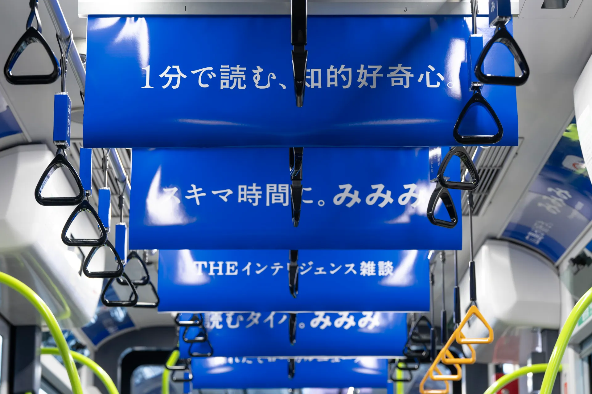
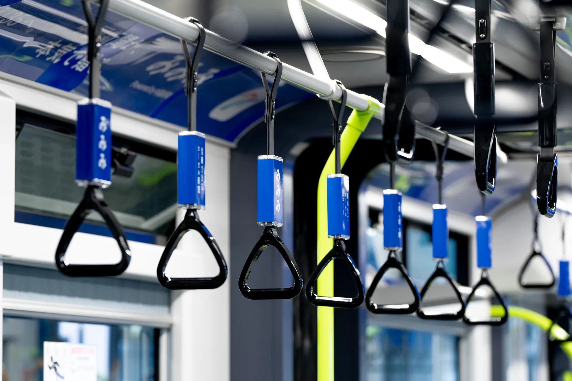
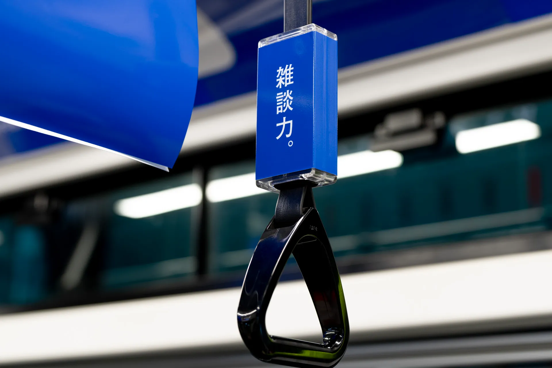
The boldest transportation ad was a tram ad that took over an entire tram running through downtown Hiroshima. We tailored the copy to different display locations, such as overhead signs, above the windows, and on the handrails, and promoted “Mimimi” to the younger generation commuting to work or school through 25 diverse angles. We also displayed posters at bus stops and commercial facilities in the city center. We prepared a unified message on the campaign’s landing website and in app stores, creating a clear path from awareness to usage.
This initiative, which combined digital and physical touchpoints, succeeded in generating 2.3 times more website visits and 7.1 times more app downloads within the first three days of the campaign compared to the average daily figures on days when no campaign activities were taking place.
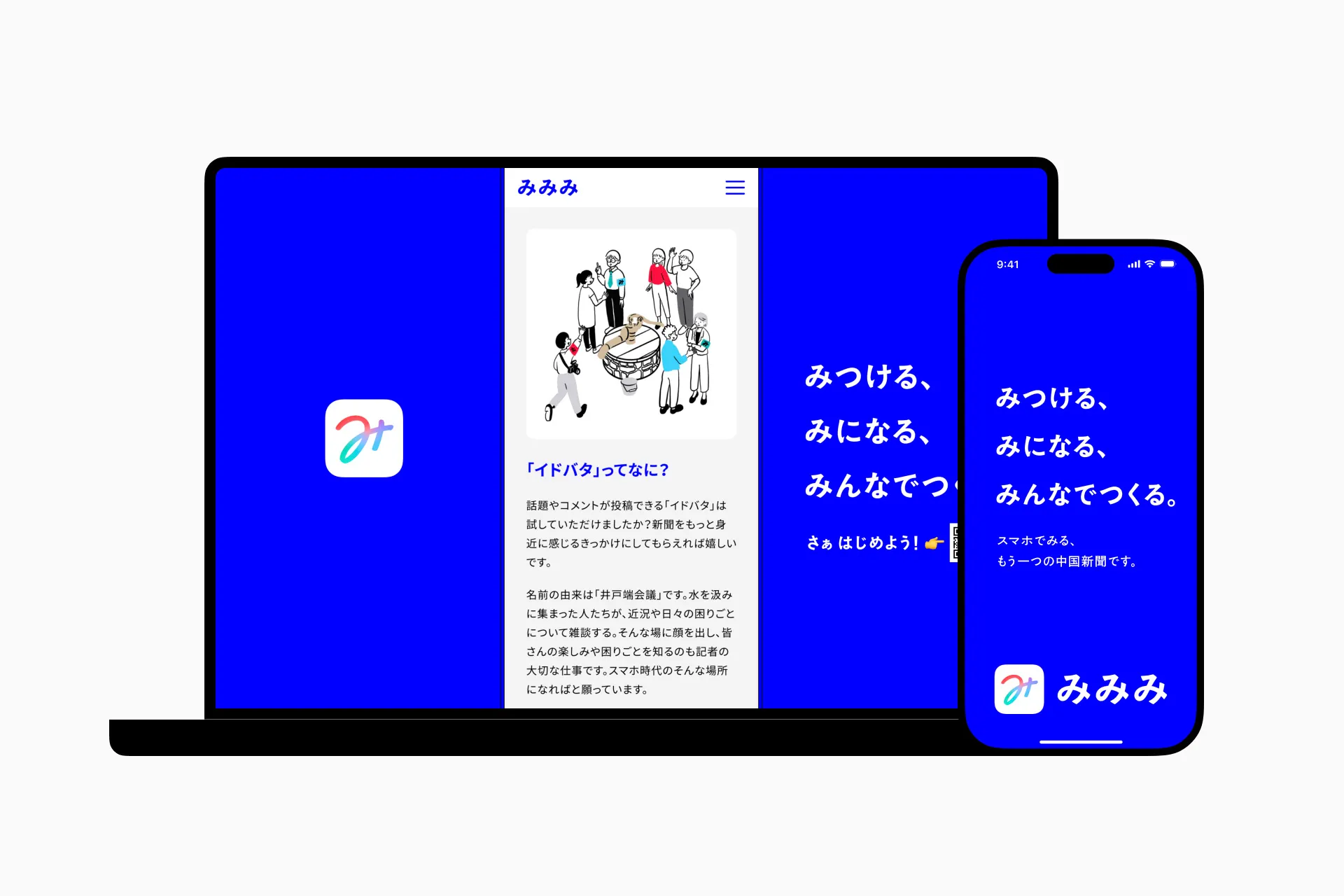
What is necessary to create a great experience? At the start of every project, Fenrir always takes a step back to reassess. First, we build strong, collaborative relationships with all stakeholders, including users, our team, partners, and decision-makers. To achieve this, we convey a consistent message across all touchpoints, both internal and external (such as proposals, design documents, apps, and advertisements). We maintained this same approach throughout this project, moving forward while clearly communicating how each initiative and deliverable would help bring “The Responding Newspaper” to life.
The Chugoku Shimbun always listened to our proposals with an open mind. We succeeded in translating our shared goals into a tangible user experience through thorough exchanges of ideas and repeated discussions. As a result, we were able to support the first step toward co-creation between the Chugoku Shimbun and the digital generation.
Future Developments
The app’s release is merely the first step for the Chugoku Shimbun in building a new relationship with young people. The challenge of meeting user expectations and delivering a new news experience to the digital generation is just beginning. Even after the release, Fenrir hopes to continue contributing as a service design partner.
Judges’ Comments
This app serves as a bold and innovative bridge connecting traditional journalism with the digital native generation. By integrating service design and human-centered design (HCD), it meets the evolving needs of young users, fosters critical information literacy, and combats misinformation. The “Water Cooler” feature, which allows direct interaction with journalists, embodies transparency and a commitment to local co-creation. The intuitive, user-centered design, including the visually appealing “This is it” feature, ensures that users remain engaged and informed. By deepening understanding of information ethics, encouraging civic participation, and providing unbiased insights, this app demonstrates the power of design to create new value within the existing industry.