Creating a service that will continue to be loved, envisioning the future of “Tenorino”
“Tenorino” is a free childcare video streaming app provided by Sunloft, whose key feature is its ability to connect kindergartens, daycare centers, and certified children’s centers nationwide with the families of their children. In response to the growing demand for video streaming in early childhood education and childcare settings during the COVID-19 pandemic, the service was launched in June 2020 as an easy-to-use platform for facilities to share their daily activities and childcare routines.
About a year after its release, the service has been adopted by over 2,300 facilities and has grown into a service cherished by many facilities and parents, with a 97% user satisfaction rate among parents. It continues to be used even after the pandemic, and thanks to the ingenuity of the facilities that have adopted it, various ways of utilizing videos beyond what was initially anticipated have emerged, leading us to explore new possibilities.
Consequently, a project was launched to envision the future that Tenorino should aim for, by defining the role the service will play and the value it will create. Fenrir participated in the project as a service design partner. Together with Sunloft, we worked to develop a vision that will ensure Tenorino continues to grow as a beloved service.
Clarifying the service’s vision through user research and workshops
When considering the future of the service, it is crucial to clearly define what should be prioritized above all else.
Tenorino has seen strong growth through responding to user requests. However, in today’s world overflowing with choices, simply responding to user requests forces a service into a battle with competitors to fill out spec sheets, making it difficult to create a compelling reason for users to choose it. It is not enough to merely show users what to create; we must also demonstrate the kind of world we aim to create and earn their empathy. This is, in essence, the vision.
This vision does not appear out of thin air; it should already exist as an extension of current efforts. Therefore, we began by clarifying what the service values most.
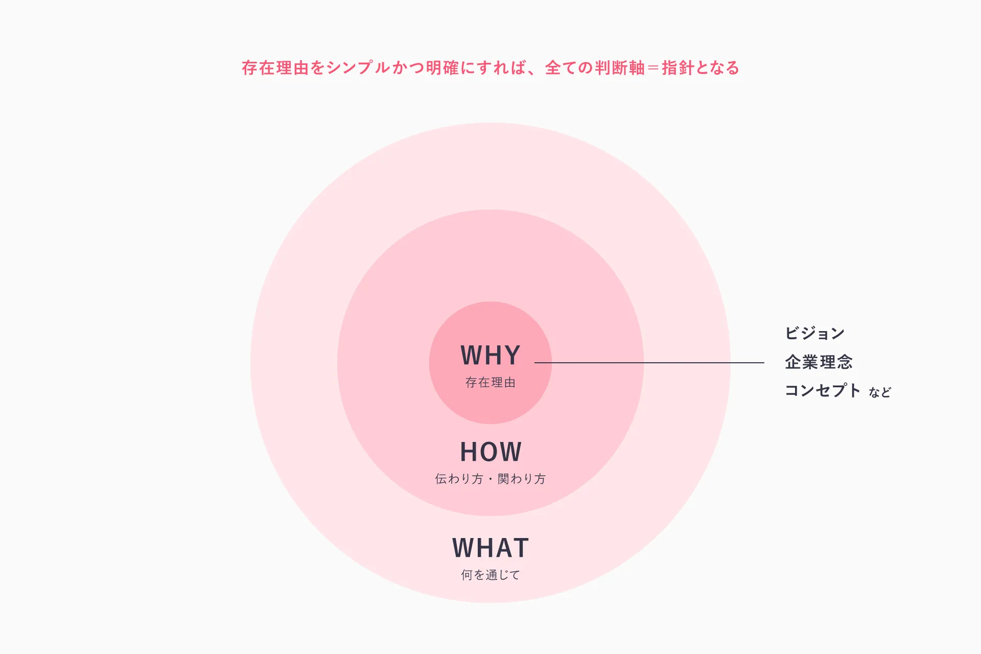
First, to explore what role Tenorino currently plays and what value it creates, we decided to draw insights from user feedback. The service’s main users fall into two categories: childcare providers who record and share videos at daycare centers, and parents who view those videos at home. We conducted a survey of parents and online interviews with childcare providers to identify how the service is being used and what value users perceive.
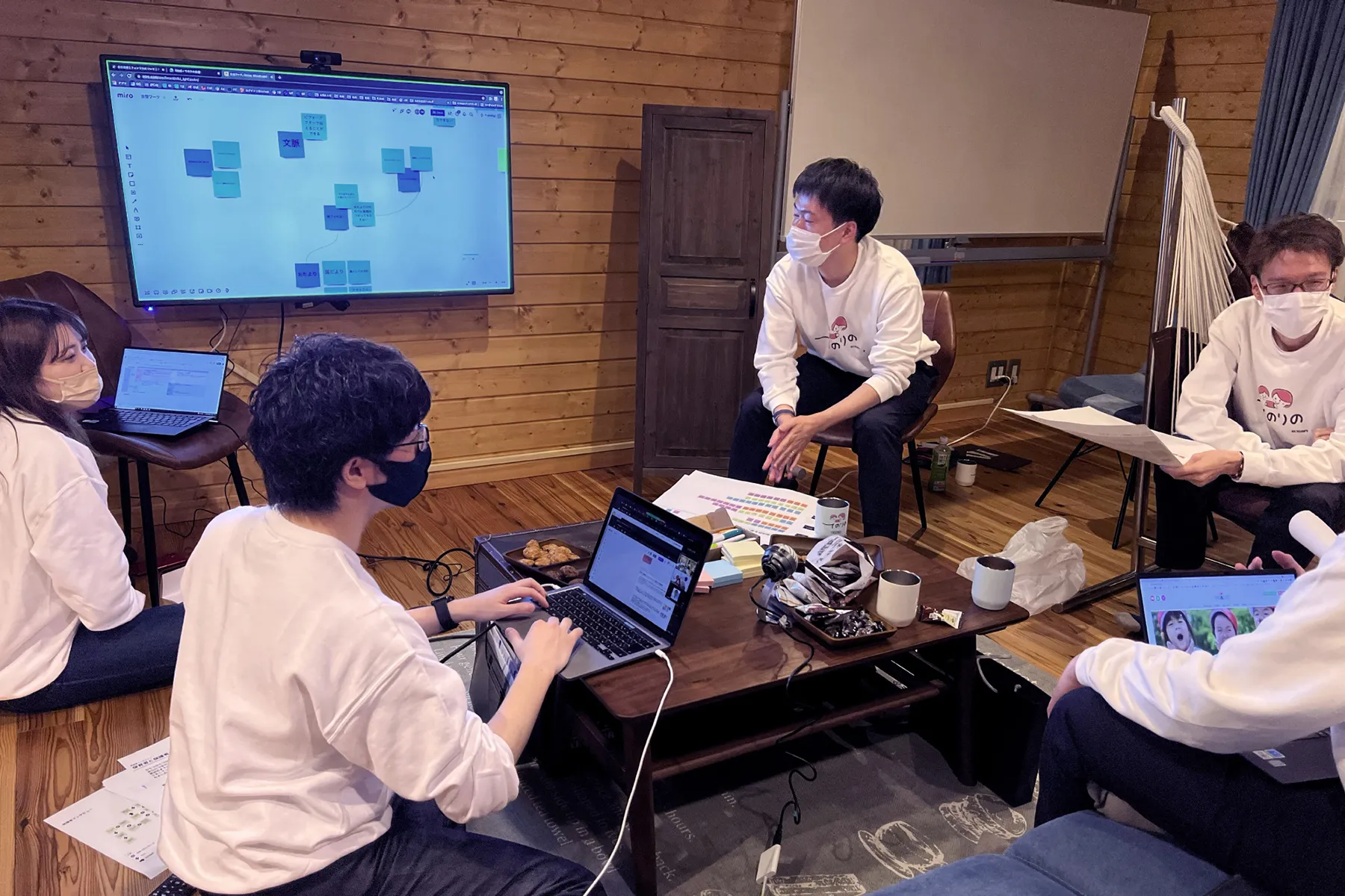
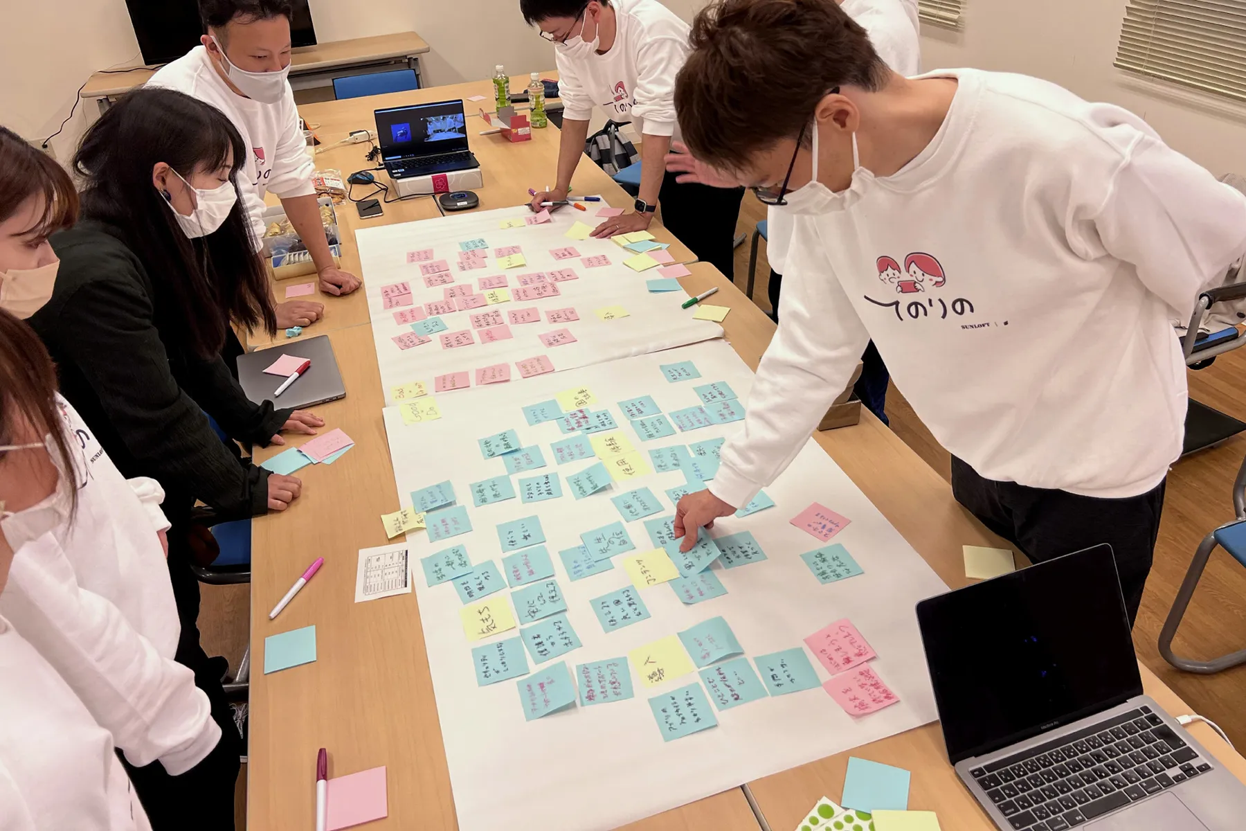
Based on this information, we held a two-day collaborative workshop. By working together to define what “Tenorino” represents from the perspectives of both users and service providers, we discussed what should be prioritized above all else.
On the final day, the entire team reached a consensus on “what we want to prioritize for the future of Tenorino,” and formulated our vision based on several keywords that emerged from this discussion.
Fenrir organized the key elements and distilled them into a single sentence that defined the vision in the simplest terms, which we then proposed. We held repeated discussions with Sunloft based on this proposal, paying close attention to even the finest nuances, and ultimately arrived at the phrase “Making peace of mind in parenting the norm in society”, a statement that captures the essence of Tenorino.
We also developed a brand statement and brand personality that clearly articulates the vision, giving this abstract service a more concrete shape. By clearly defining the future we aim for and using it as the foundation for all discussions, we create consistency in the service, which in turn leads to long-term growth.
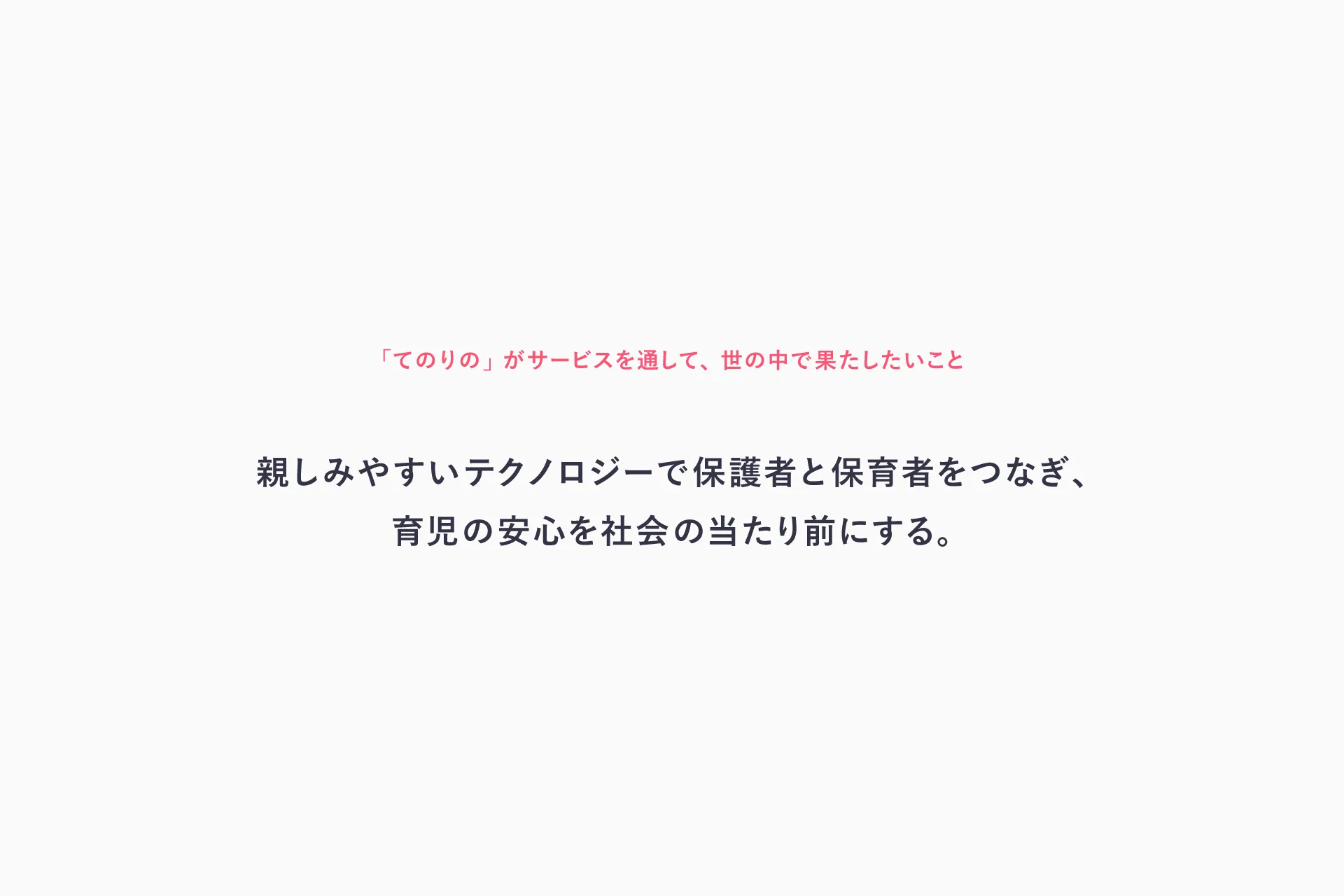
Creating services for a future where peace of mind in child-rearing is the norm in society
“Making peace of mind in child-rearing the norm in society” is a very ambitious goal. It would be nearly impossible to consider this from the perspective of “what must Tenorino provide to make this a reality.” This way of thinking is known as “goods-dominant logic.” Because it defines businesses as “producers” and users as “consumers” within a one-sided relationship, the value that can be created is limited to what can be produced.
However, we are now in an era of value co-creation, where services are developed together with users. Since businesses are also defined as “creators who generate value” alongside users, the value that can be created expands infinitely depending on how they engage. This is known as “service-dominant logic,” and it is one of the most important concepts in service design.
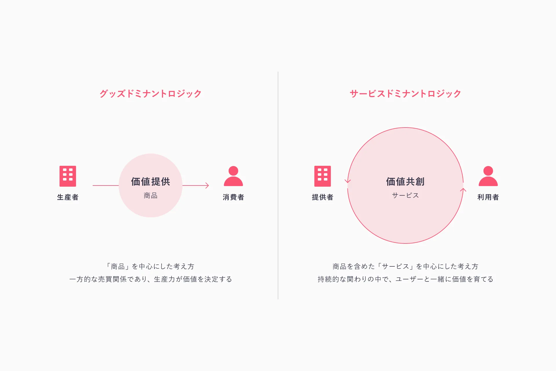
To realize Tenorino’s vision, it is essential to incorporate this perspective of value co-creation into our services. Therefore, we asked ourselves: Is there a system that involves not only parents and childcare providers but also childcare-related businesses, experts, and local residents to raise children together?
This led us to the concepts of “closed” and “open.”
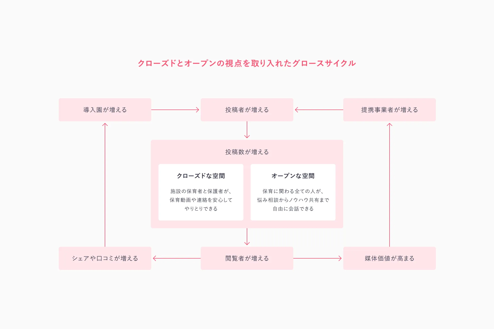
“Closed” refers to an intimate space centered around the daycare center and the home. Here, users who interact directly with the children, parents and childcare providers, form more direct and deeper connections. “Open” refers to an accessible space where those involved in childcare can interact broadly. It functions as a forum where parents, childcare providers, related businesses, and experts from across the country can share their insights, with the collective knowledge and support of many people sustaining parents and childcare providers.
Based on this idea, we used the Growth Cycle to bring to life a mechanism for co-creating value, including experiences, revenue, and increased awareness, and envisioned what Tenorino’s service might look like in the future.
Visually illustrating the service’s direction
While we were able to define the vision through words, it’s difficult to imagine what the service would actually be like based on that alone. Therefore, we prototyped the core elements of the service, such as the logo, key visuals, and the app, to better imagine what they might look like.
It is only by translating abstract concepts into tangible forms that we can truly form a concrete image of the service. Through this prototyping process, we simulated how Tenorino would engage with users and grow over time.
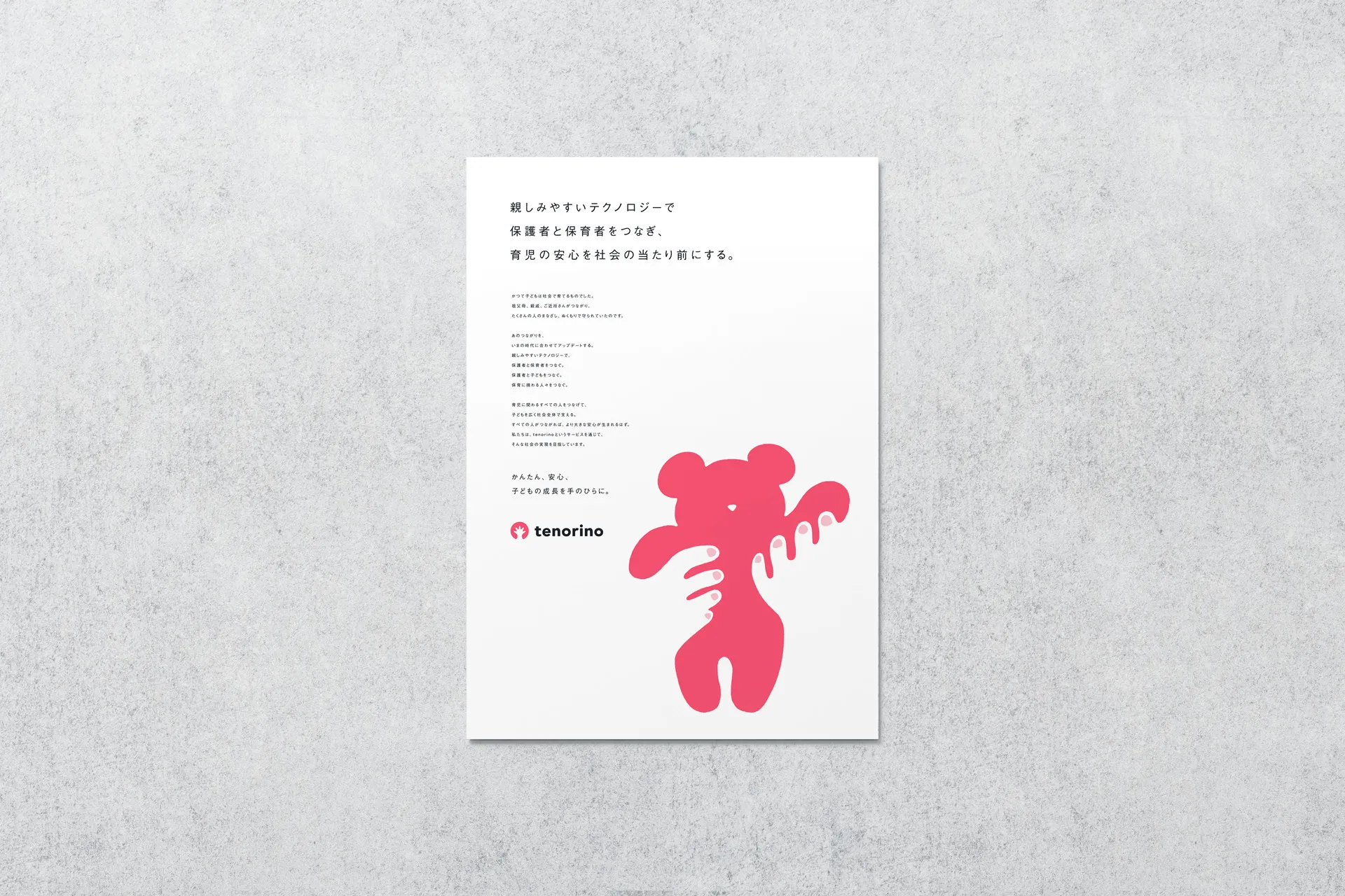
To begin the prototyping process, we started by crafting a brand statement. This is a message that expresses Tenorino’s goals and articulates the brand’s purpose and philosophy.
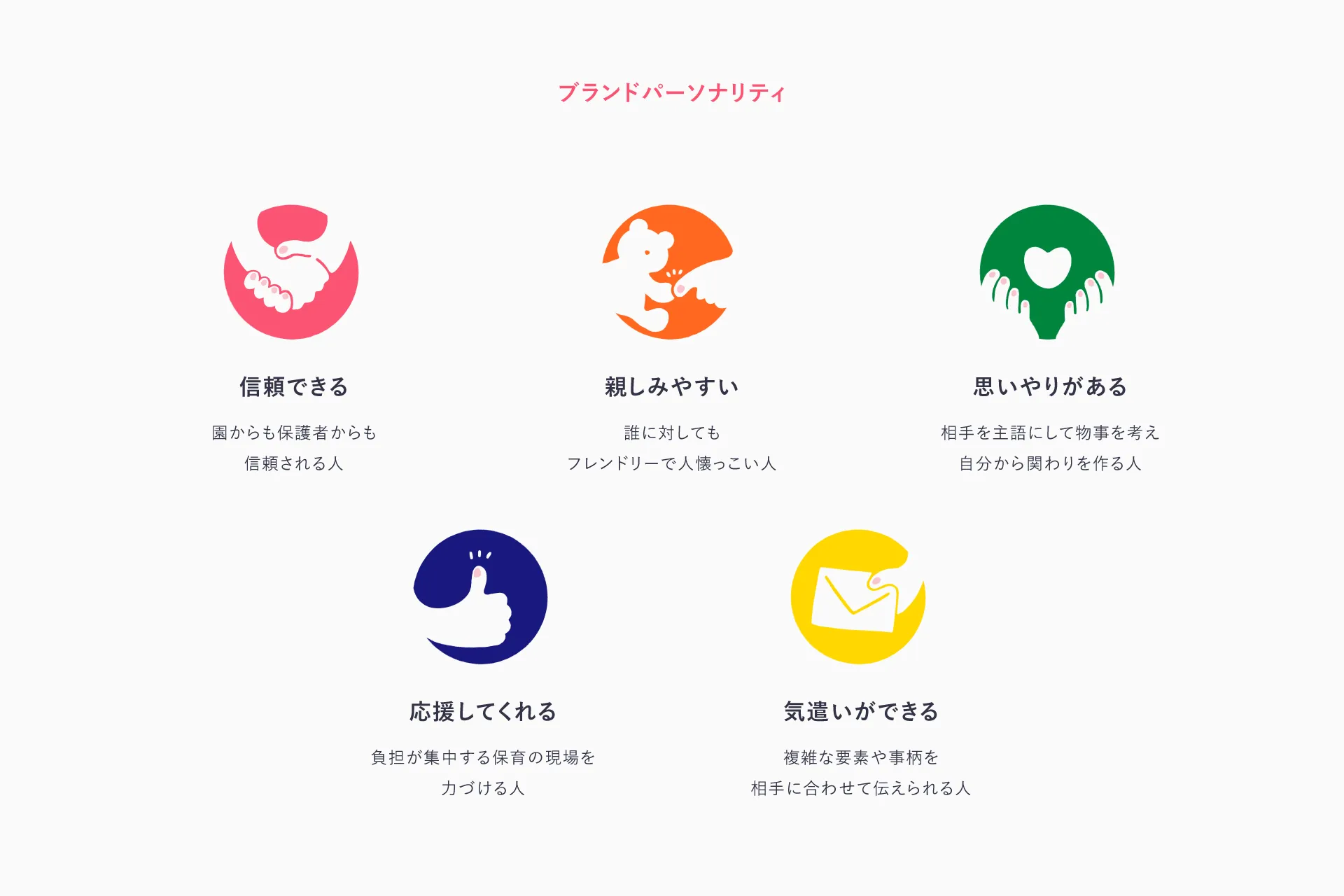
We also defined the brand personality. This is the process of determining the brand’s image, in other words, what makes “Tenorino” unique. We narrowed down the brand’s characteristics by imagining: “This is the kind of person Tenorino is.”
Here, we defined five characteristics: “reliable,” “approachable,” “caring,” “supportive,” and “thoughtful.”
Defining the brand personality in this way provides a benchmark for determining the tone of visuals and copy when devising specific initiatives. It’s a crucial process for building a shared understanding among project members as we consider what a “Tenorino-like” appearance and tone of voice should be.
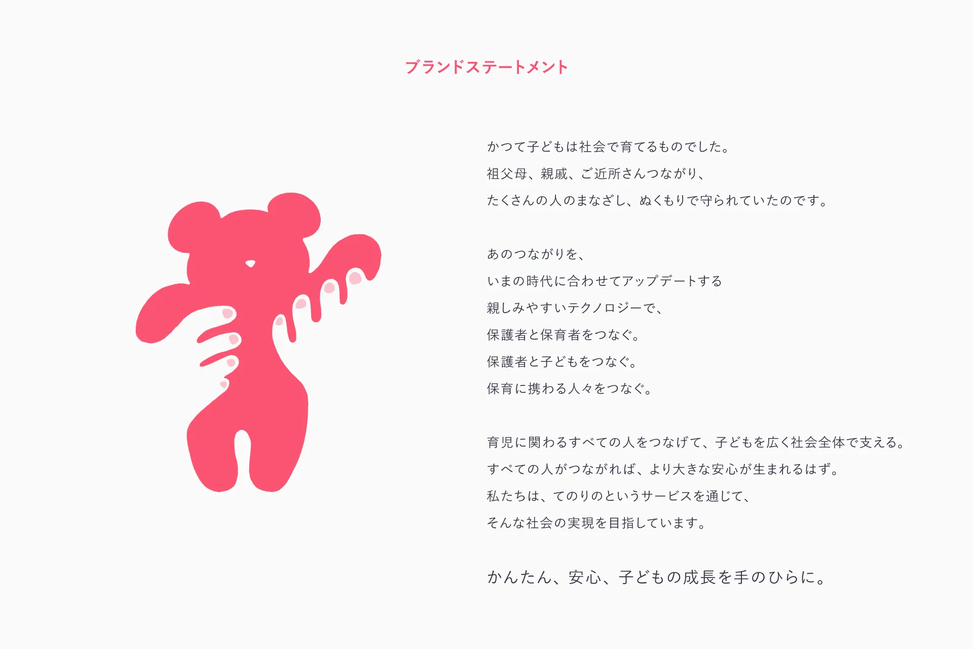
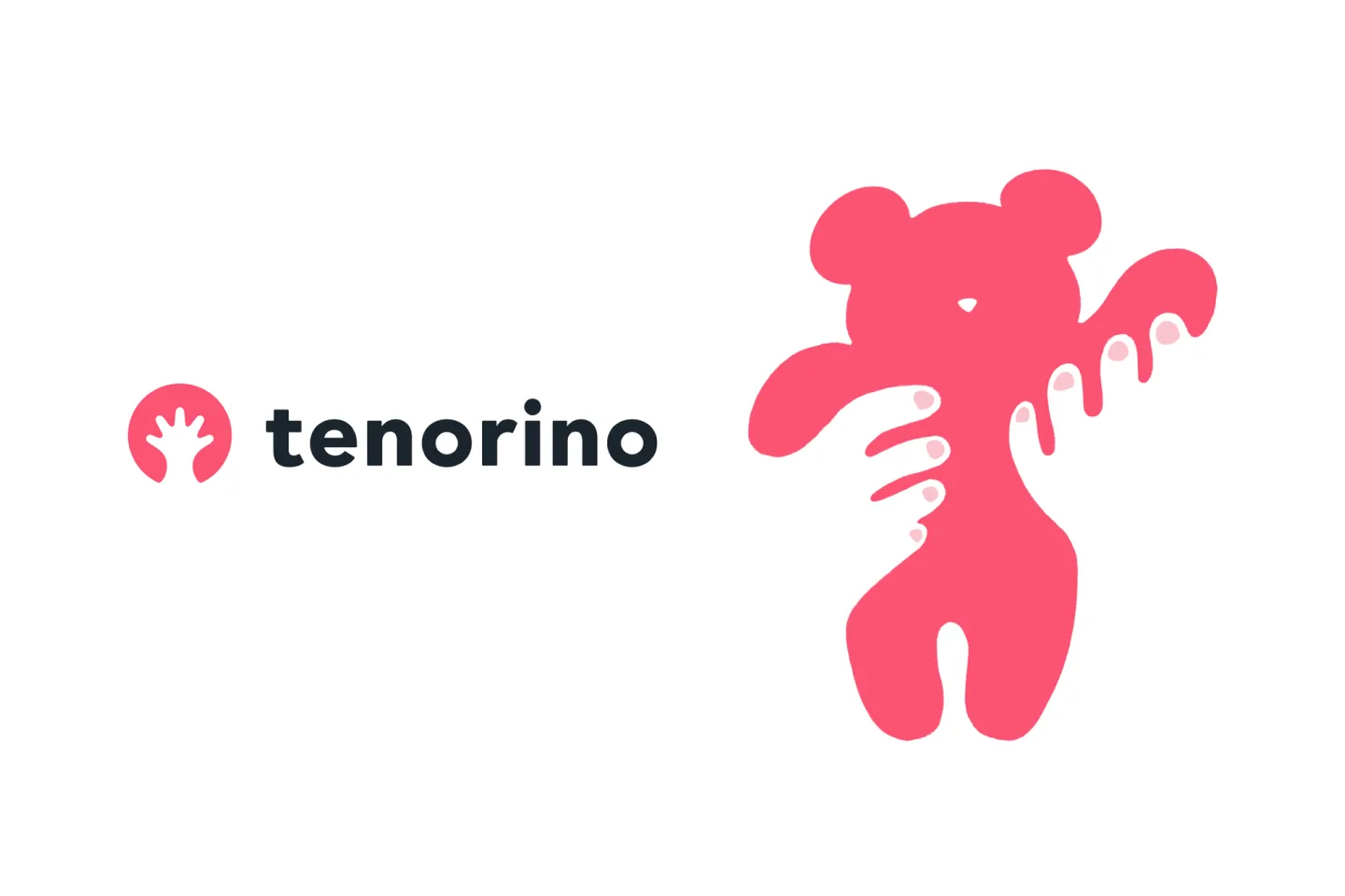
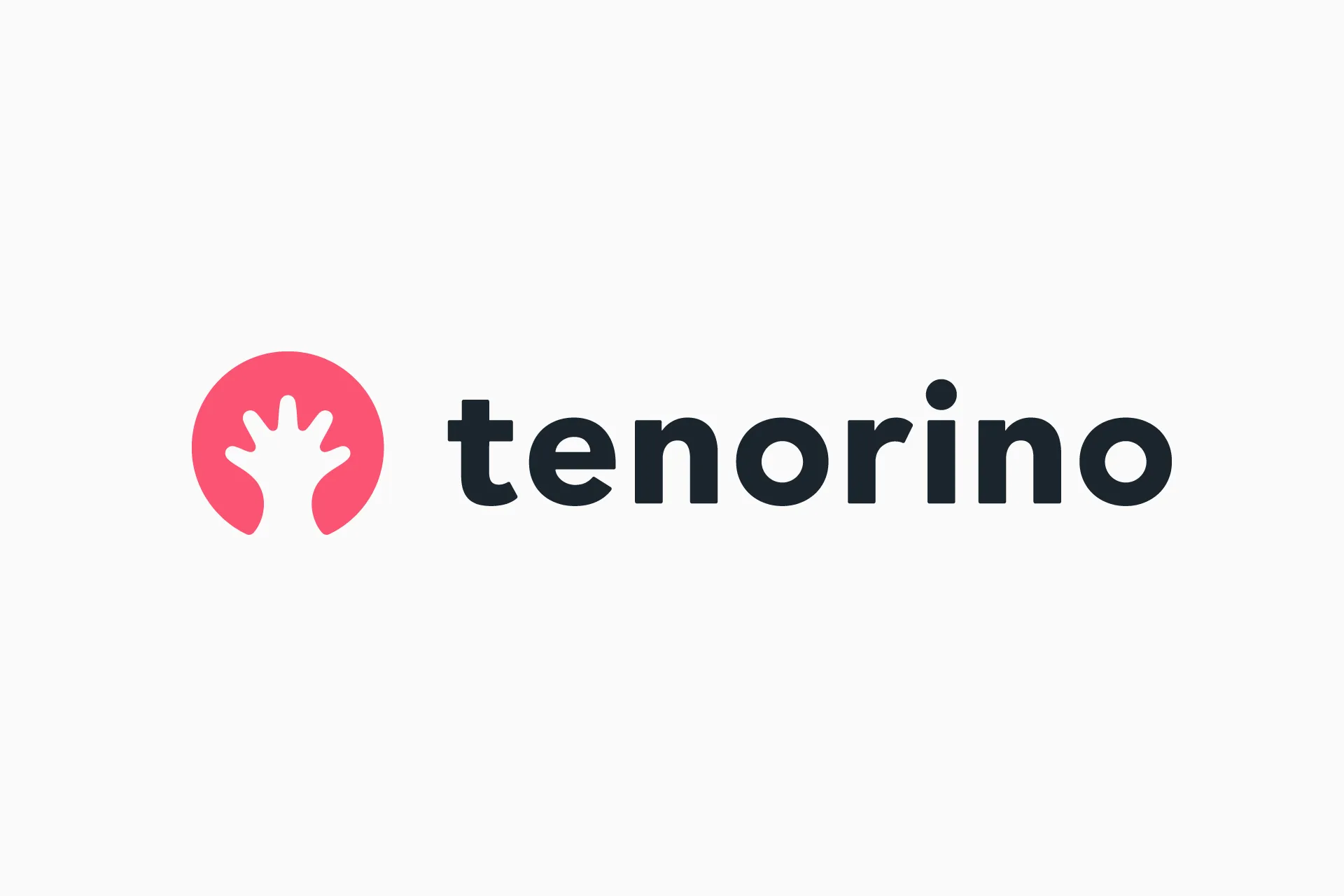
The service name “Tenorino” carries the meaning of “watching over a child’s growth from the palm of your hand.” Drawing directly from this concept, we considered expressing the service’s visuals using the motif of “hands raising a child”, representing not only parents and childcare providers but also the many people involved in child-rearing.
The symbol mark is an abstracted visual designed to convey its meaning even when small. Precisely because it is abstract, we infused it with a playful quality so that, depending on how you look at it, it can resemble either a tree growing vigorously or a circle expanding in all directions.
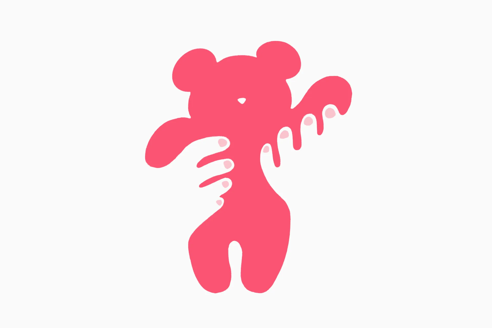
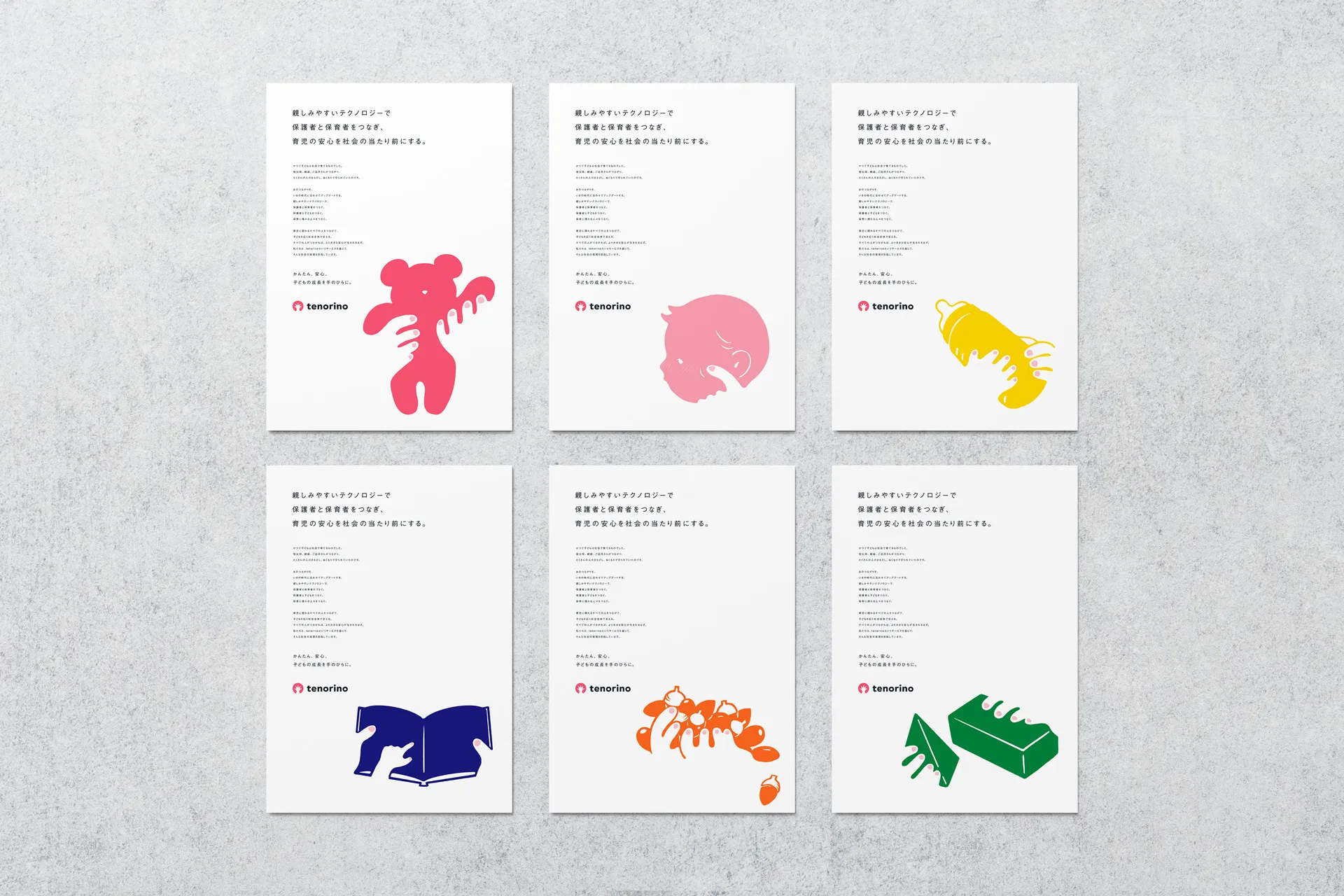
Since the key visual can also be used at large sizes, we opted for a more concrete representation. We depicted hands playing with a stuffed animal using an approachable illustration. In addition to the stuffed animal, there are a total of six types of illustrations, including a baby’s cheek, milk, a picture book, an acorn, and building blocks, each representing a moment of raising a child.
Both the symbol mark and the key visual depict hands using negative space. The reason for this is that “Tenorino,” which connects children, parents, and childcare providers, is meant to support users from behind the scenes rather than taking center stage; we felt a subtle, unobtrusive appearance was most appropriate. We visualized the ideal image of “Tenorino”: present but not directly depicted.
The logotype accompanying the symbol mark was custom-designed based on an existing Western typeface. We changed the service name to Romanized characters because there was an issue with it being difficult to find in search results when written in hiragana. To convey the trustworthy and approachable impression inherent in the brand personality, we aimed for a design that is both crisp and warm.
Validating the Ideal Product Vision at a Feasible Level
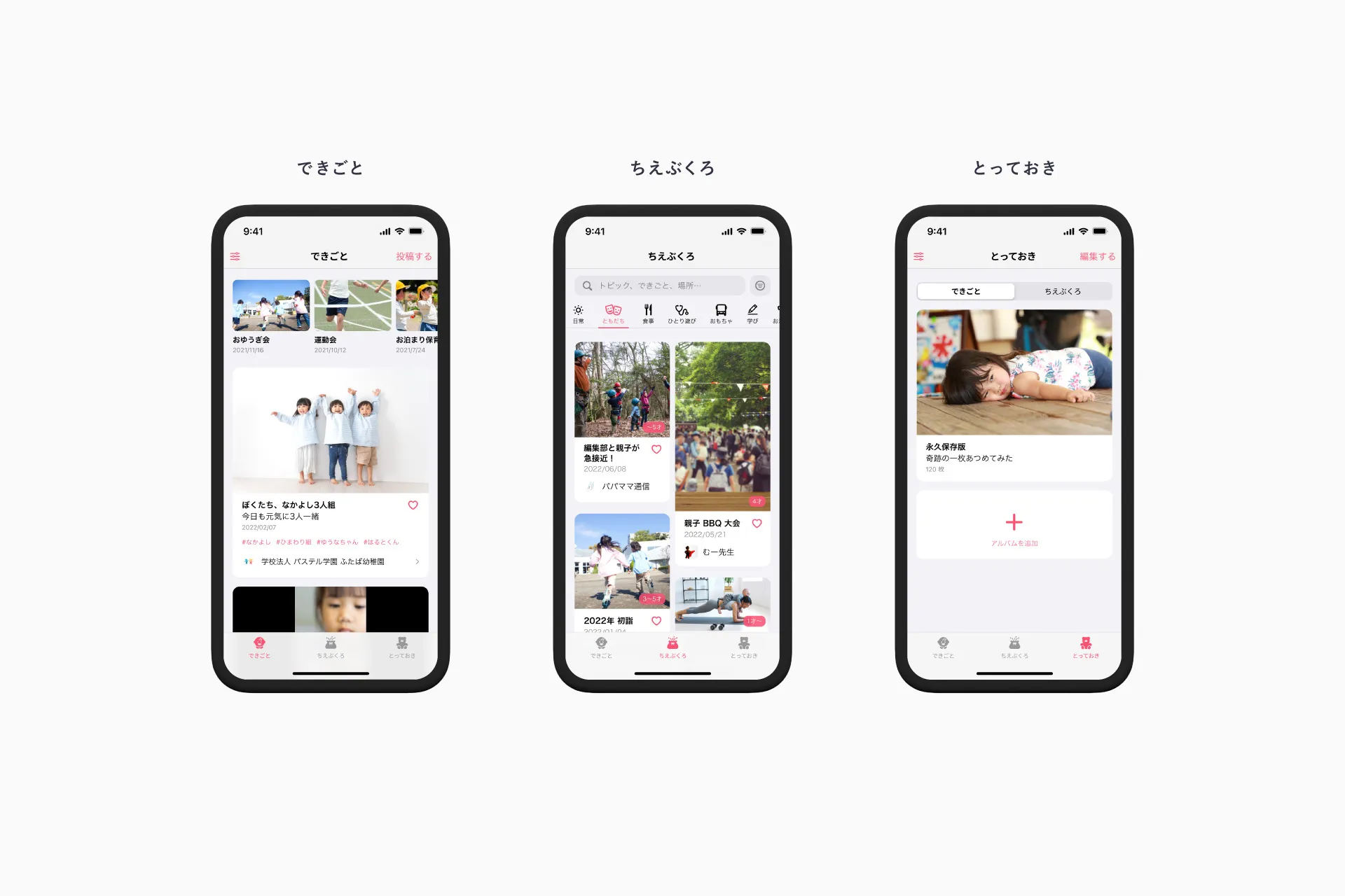
What kind of app incorporates the concepts of “closed” and “open”? To solidify our vision as a project team, we created a prototype of the app’s concept model.
For information architecture, we began by reverse-engineering existing apps from an OOUI (Object-Oriented UI) perspective. We organized the elements based on real-world use cases and the vision we aimed to achieve. We narrowed down the most important elements of the app (the core domain) and examined its structure.
The core of the app consists of two spaces: “Closed,” where facility guardians and childcare providers can communicate privately and with peace of mind, and “Open,” where anyone can participate and communicate broadly. By incorporating these elements as tabs, we created a new structure that allows users to move seamlessly between the two spaces.
With an iOS app in mind, we built the framework in accordance with Apple’s design philosophy, which forms the foundation of the Human Interface Guidelines. By creating a mockup using SwiftUI, we aimed for a conventional object model and screen layout while simultaneously exploring a minimal infrastructure configuration.
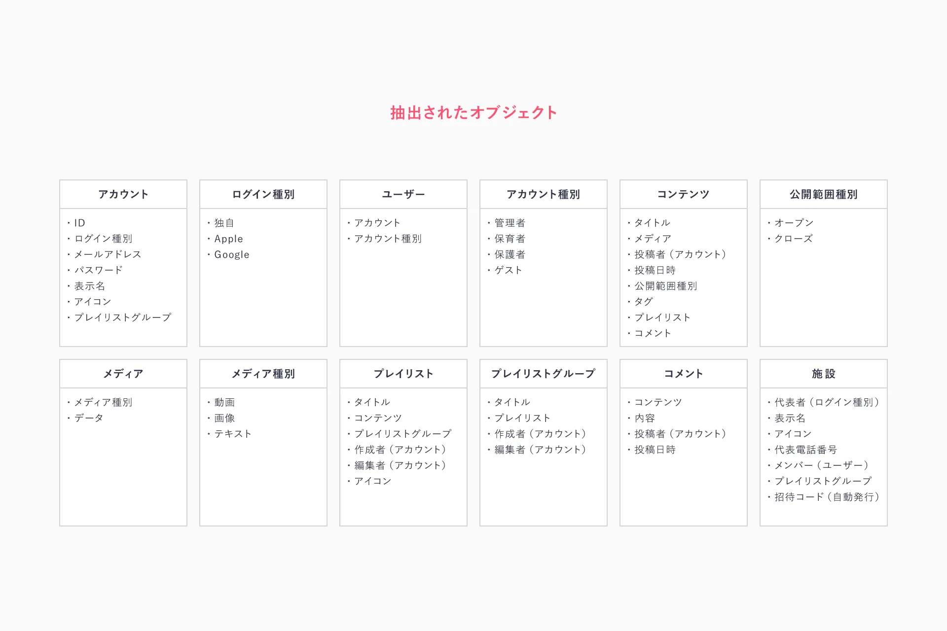
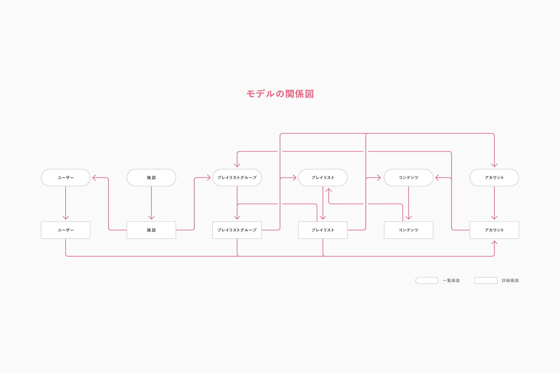
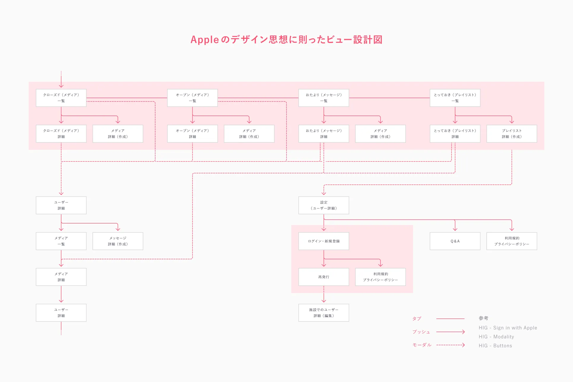
Although this was a concept model, it was more than just a facade; it was designed at a level of detail that allows for direct implementation. We created a highly scalable design that anticipates an increase in the number of features and types of content as the service grows.
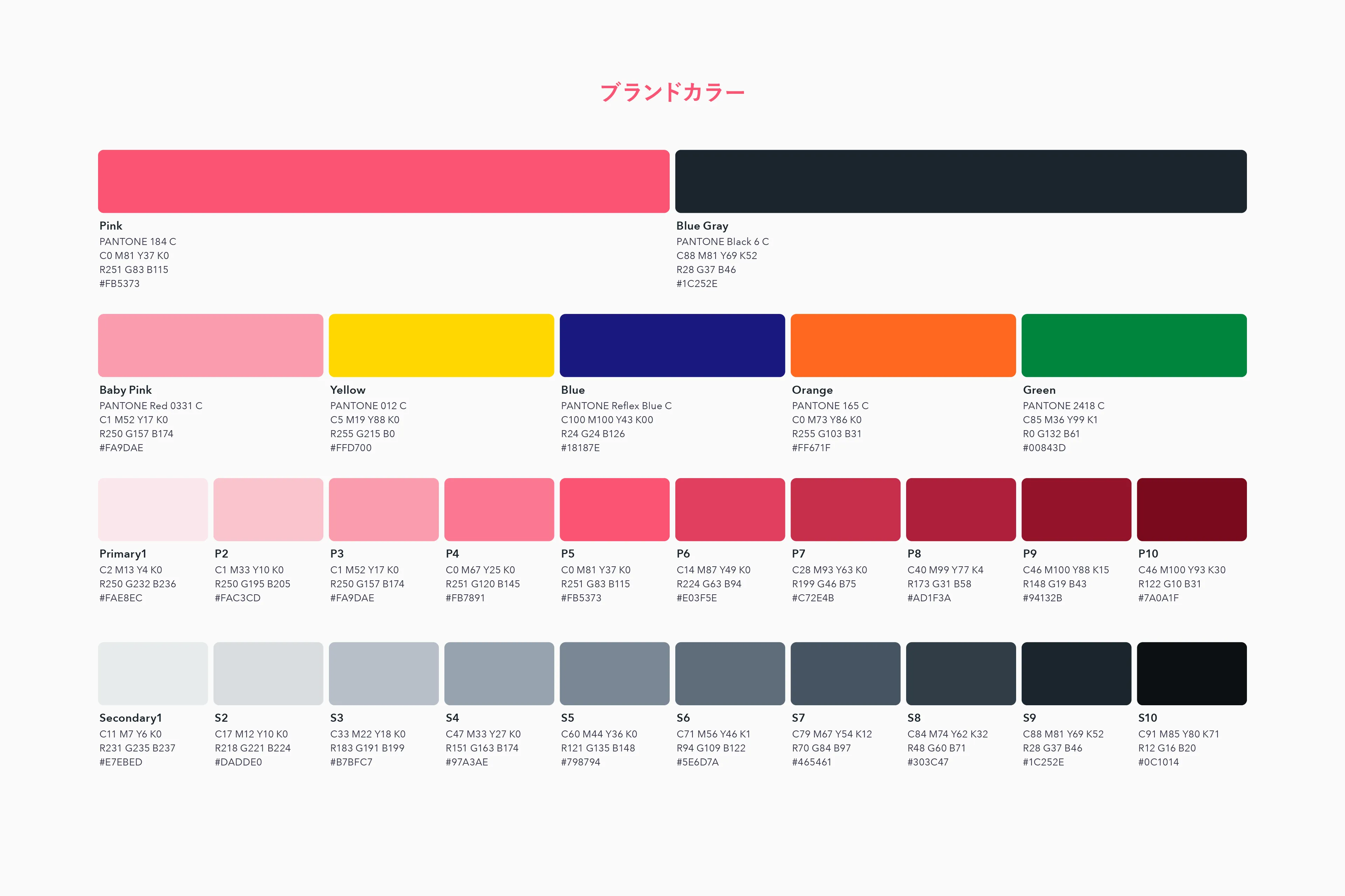
From a visual perspective, we created a color palette consisting of 10 shades, centered around primary and secondary colors, to make it easier to apply the brand colors within the project.
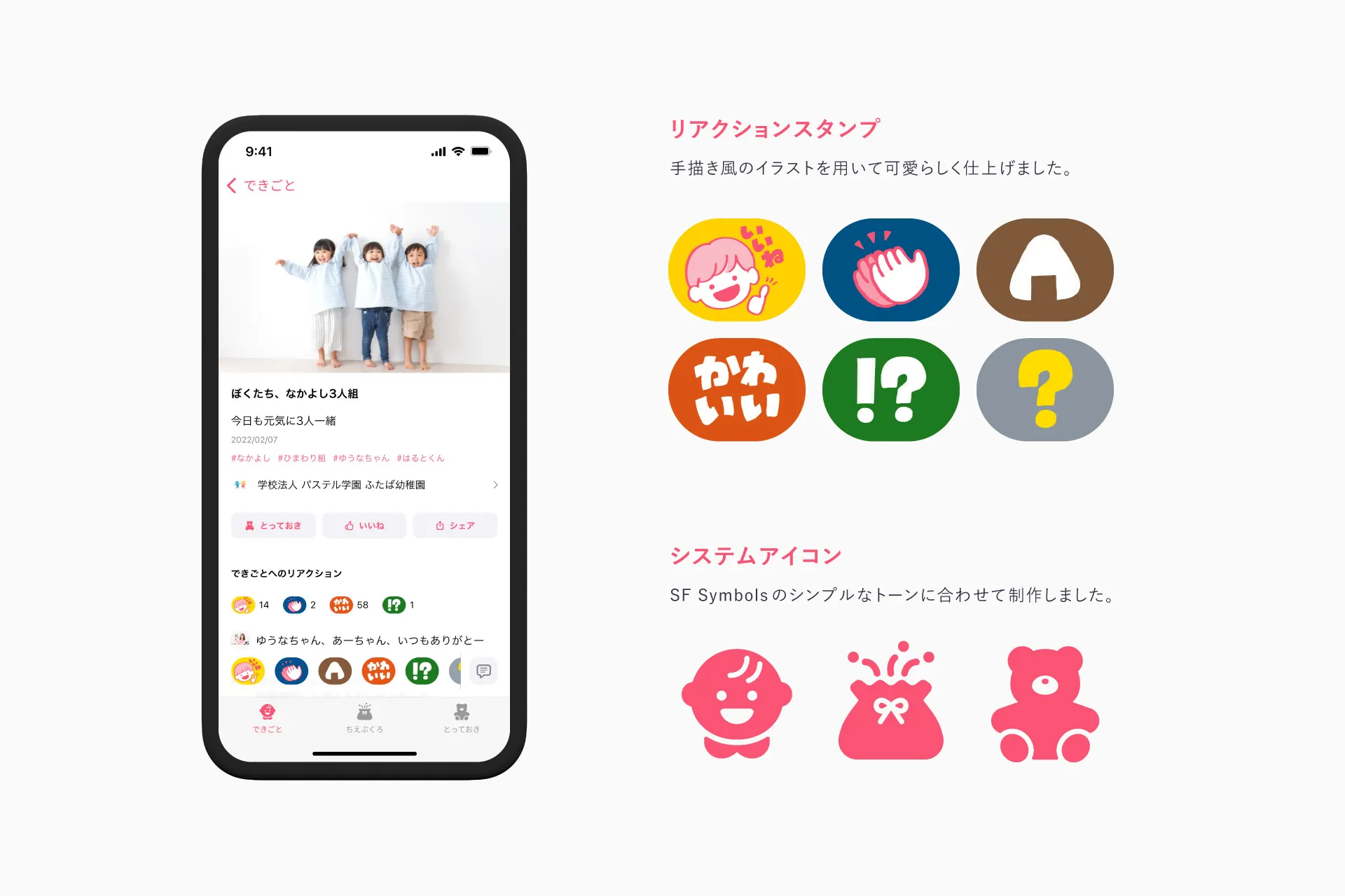
We also designed system icons for the main features displayed in the tab bar, as well as the stickers used by users to communicate with one another. For both sets of visuals, we made a conscious effort to create a tone that aligns with the logo and key visuals.
Feedback from the Client
In this project, we placed great importance on involving team members who were not directly involved in the design process in creative decisions as if they were their own. This is because we wanted everyone to feel a sense of attachment to the finished product and for it to grow alongside us as we continue to use it over the long term.
I’m truly delighted that Tenorino’s team managers, marketers, and support staff openly shared their opinions, and that everyone at Fenrir embraced those ideas and refined them further. I feel a sense of accomplishment that we’ve created something great, and I’m excited to see how Tenorino will continue to grow from here.